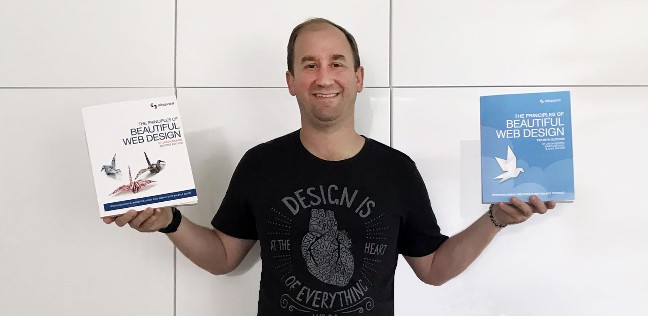
It’s amazing to me that The Principles of Beautiful Web Design is now its fourth edition. I never imagined that my basic introduction to layout, color, texture, type, and imagery for the web would still be going strong after nearly 14 years. Alex Walker did a fantastic job giving the book a much-needed 2020 overhaul, providing a new case study, replacing all of the website screenshots throughout the book with current examples, and even designing the new blue cover. I occasionally have friends ask how I ended up writing a book, but I haven’t written much about it, so here’s the short version.
As a wee web designer in the early 2000s, I spent many an evening in the Internet section of Barnes & Noble. I would buy a cup of coffee and read through titles like Jeffrey Veen’s The Art and Science of Web Design, The Elements of User Experience by Jesse James Garrett, or the latest edition of Net Mag – if there was a copy on the shelf that wasn’t wrapped in plastic.
One of the many books that inspired me during that era was “Fresh Styles for Web Designers: Eye Candy from the Underground”. In it, Curt Cloninger shared a playfully, subversive taxonomy of indie website screenshots, grouped by “schools” with titles like Pixelated Punk Rock, 1950’s Hello Kitty, and Super Tiny SimCity. I purchased the book during one of those evening trips to B&N in 2001 and thought to myself that if I ever had the chance to write a tech book, that I wanted it to be just as fun, informal, and screenshot driven.
Fast forward to late 2004 and that opportunity landed in my inbox. Back then, I was regularly redesigning my personal site, was active in CSS gallery communities, and wrote frequent blog posts about design and markup. Still, I was shocked when I got this short email from SitePoint’s managing editor:
“Hi Jason, I’m currently looking for an author for a book on graphic design for web developers. I think you might be the ideal candidate for writing it – would you be interested in a spare time writing job?”
Imposter syndrome doesn’t even begin to describe how I felt about authoring a book so early in my career, but I rolled with it anyway. I quickly proposed a table of contents and wrote a cheeky sample article for SitePoint.com titled “Color for Coders” which was published in December of 2004.
A few days after my article was published, I completely backed out. I had fun writing the sample, but wasn’t sure if I could commit to an entire book. On top of that lingering doubt, Ames was waiting to hear back from grad school applications and we didn’t know where we’d be moving to in the next 6 months. We ended up moving from Florida to South Carolina and were pretty well settled in 2006 when that same editor from SitePoint reached out again. Before I knew what I was getting myself into, I had signed a contract (with chapter deadlines) to write, “Design for Developers”.
I was working from home full-time, so I did all the writing on nights and weekends. My schedule for most weekdays was to work my 9-5, take a break to eat dinner with Ames when she got home from school and then work on the book till 2 or 3am. It took about 7 months of that and by the time I finished, I was completely exhausted. I didn’t know if it was any good or whether anyone would ever read it, I was just glad to be done.
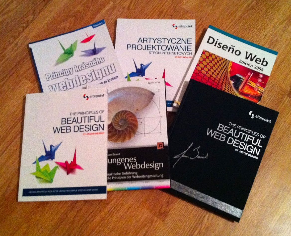
The first edition was published in February of 2007. Instead of Design for Developers, SitePoint released it as The Principles of Beautiful Web Design and I was pleasantly surprised when the positive reviews started rolling in. I was even more surprised when I heard that it was being used as a design textbook for a few big colleges and universities. The book went on to become one of SitePoint’s bestselling titles and was translated into several languages. It’s still a humbling experience whenever I meet someone at a conference, or even when interviewing a design candidate, who says they’ve read my book.
A lot has happened in my career since the first edition was published. I switched agencies, took on some speaking engagements at conferences, started organizing a conference series with some friends, and eventually made the jump from agency web design to in-house product UX. In 2010, I took on a comprehensive second edition rewrite. I replaced all the examples and rewrote my original haphazard case study with a real-life web design project where the contractors and client were both personal friends. I was very proud of that update.
In 2013, SitePoint reached out again about starting on a third edition, but by that time, Ames and I had a newborn and had started on a major home addition and renovation project. I delayed a few times, but SitePoint eventually decided to bring on another author to make the updates, which was published without my review in July of 2014. I didn’t really talk about it publicly, but there was a lot that I was frustrated about with the third edition. SitePoint offered to let me make changes, but we had 2 under 2 at that point, so there was no way I could put any time into it. I eventually realized that thing I was most upset about was losing control of something I had created. So, I let it go and I moved on.
I thought the story was done, but a few years later SitePoint reached out again to ask if I had any interest in taking on a fourth edition. I didn’t even try to delay this time. I gave them my permission to move forward with an update, which they eventually did. I was glad to hear that Alex Walker, who has been writing and developing at SitePoint for over 19 years, was chosen to make the updates.
Yay. I'm a officially a published author! Was a bit nervy taking on the fourth edition of a SitePoint classic, but really happy with how it turned out. Have a peek here –> https://t.co/vphnpZAcgS pic.twitter.com/eytV1qM3NW
— Alex Walker (@alexmwalker) September 14, 2020
I’ve spent some time going through Alex’s fourth edition updates, side-by-side with with the second edition that I worked so hard on and I’m delighted. The case study, the example sites, the CodePen markup samples are all fantastic additions. If you want to check it out, the paperback is available on Amazon, but the best way to read the fourth edition is online with SitePoint Premium. For $9/month, SitePoint Premium gives you unlimited access to 130+ courses and over 330+ books on web design and development – including, of course, the fourth edition of The Principles of Beautiful Web Design!


Wow that was great to read about the history of this book. I am glad that the 4th edition made you happy. Alex is one hell of a talented person and I am super lucky to work with him.