Update: We ended up going with a slight variation of scheme #4 below. You can see the finished color along with all the before & after pictures of our first home in my 2011 post, Here We Go Again.
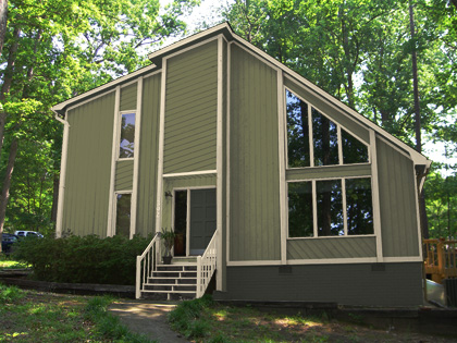
Ames and I have been talking about painting our house for a while but never decided on a color scheme. This weekend we looked through some of the color books from Home Depot and Lowes but wanted to see what they would actually look like on the house. After Photshopping them in on a picture of our home we decided to create our own. We came up with four that we like. One is a little “out there” for us, but I won’t tell you which one because we want your honest opinions.
You can click on the links below to see a 1024×768 version.
Current Color – Blech…
Scheme 1
![]()
Scheme 2
![]()
Scheme 3
![]()
Scheme 4
![]()
Help us out! Just let us know in the comments which color scheme you like the best and why. Thanks!
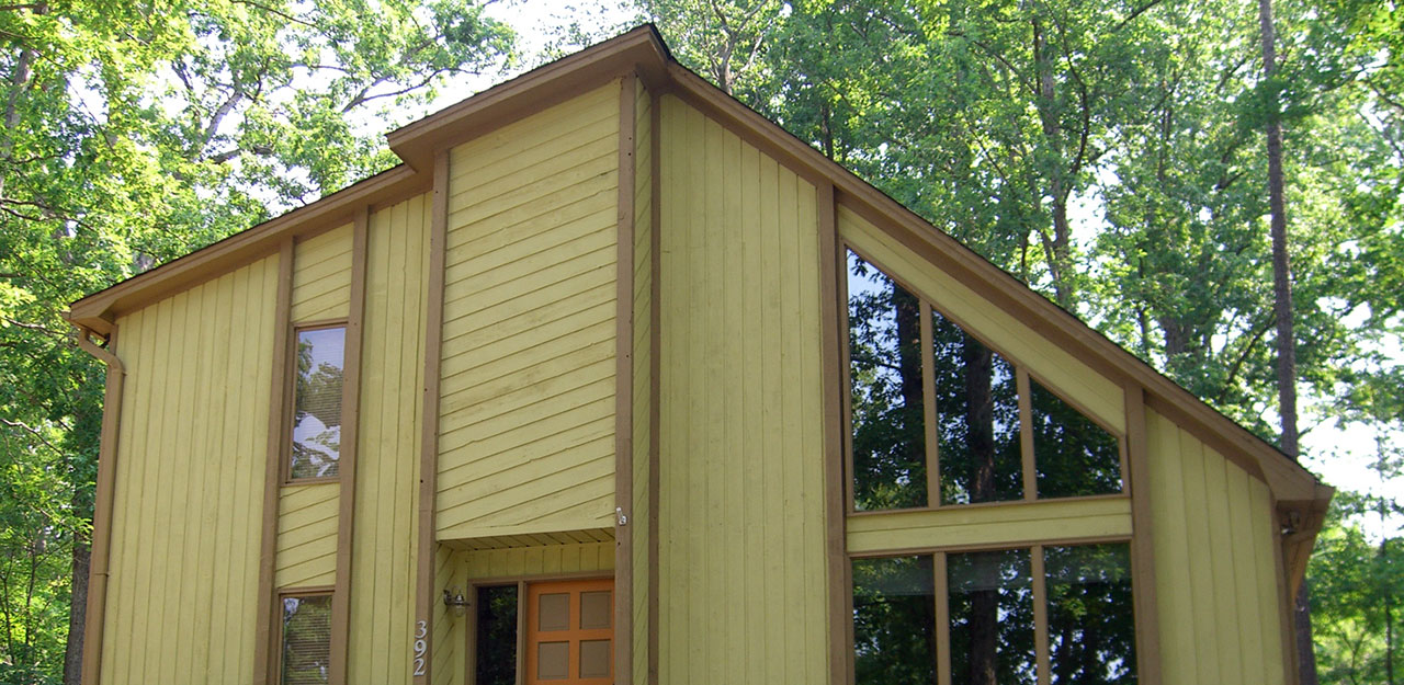
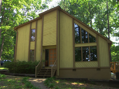

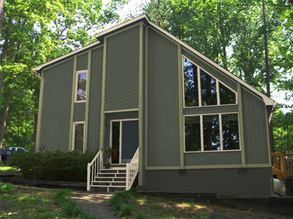
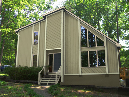
I think I’d go with Scheme 3 as my favorite…BTW, nice place!
I like scheme 4 the best. Given the photo, it makes the house fit in better with surrounding trees and looks nicer with, what looks like, the cedar deck off the right side.
#3. Not too dark, and I love the contrast of the trim.
#2: Sharp, classic colors that will endure. We just did our living room interior with similar colors for that reason. It. Looks. Awesome.
Also, #2 seems to help the lines of the house not contrast so much. Otherwise the lines might “date” the house.
(in order of best to mehh)
#4. It’s modern & classic rolled into one! Love it.
#3. Nice defined color scheme.
#1. Not bad, but not as strong as the others.
#2. My least favorite.
I’m glad to see we’ve reached a consensus here. 🙂 Honestly though, thanks for all the feedback. It’s really helpful. We printed some hard copies of each scheme this afternoon that we’re going to use to poll our neighbors.
#4 Blends with your surrounding landscape much better than the others and becomes part of it. The others tend to shout at the surrounds.
You will definitely have the eco environmentalists on your side with #4.
Well, that’s the thoughts of a bushy.
current
I’d go with #1 or #3 to reflect sunlight, the darker walls might trap the heat. Hmm, given the trees, I’m not sure if your house gets sun-baked anyway.
In order, favorite to least favorite.
4 – Bold, but not over powering
3 – Safe, I’m not sure I like the light trim though
1 – Safe, very similar to what you already have
2 – I just don’t really like this one
I like #2- good colors and contrast…
I never agree with my husband on this, obviously!
4 is ok too
I like number #4, it looks modern and lighter. Nice color contrast… It looks different from the rest of SC’s houses.
Looking forward to see the new house!!!!!
I’m between #3 and #4, but If I had to choose one it will be Scheme #4. I hope it helps.
I vote for #4, with #3 being a close second.
Get a four-sided coin (let me know if you find one). Do a coin toss. While it’s in the air be aware of which one in your heart-of-hearts you hope it is.
That’s your answer.
I like #3.
I like 3 or 4. A red door is always nice, too.
Scheme 4. It matches the surrounding background very nicely without being to dark or drab.
I would go with #4. #2 and #3 are also nice. Not a fan of #1 although a red door is lucky. Have fun.
Wife says #4, cause it’s the most subtle. Kid and me, we are both for #2, the Dark One. For me the #2 is the most monolithic and it goes well with the architecture style here (at least this side of the house :D)
#3,i like it .
In order of favorite to least favorite: 2,4,3,1.
The first one is just too dark.
3 or 4 or bright orange
4 = The most contrast. The colors pop.
Number 2 is the winner. Not too loud. Somewhat neutral and highlights the unique window design as well as the entry. It will also look good after you complete the landscaping.
Wow! We’ve gotten a lot more feedback since last time I checked this post. It’ll probably be a little while till we actually get painting (we’ve got a lot of other outdoor projects to finish first) but we appreciate all the opinions!
I like #1 best. It’s light, warm, cozy (color of the door) and blends nicely with nature. You would’t notice the color very much, but You would stay comfortly with it “being around” for a long time.
Scheme 1 seems to be the warmest, so I like it best. I think I would use more warm colors. Beautiful house.
Neat idea to mock it up in Photoshop. I’m about to paint my house and would like to do something similar to help choose the perfect color. How did you get the colors to look so real and flat? Did you just play with the opacity/fill? Also, I’m curious how you chose the different color palettes. We’re you able to get the RGB values from the catalogs? Thanks.
your house looks great! please, DO NOT choose scheme 1. Tom suggests orange, and I tend to agree. green house in a green forest? how about [1] warm deep reds or mustard yellow or [2] cool gray?