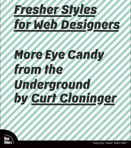
As I mentioned in my previous book review, a sequel to one of my favorite web design books of all time was published in late December and I didn’t even know. Curt Cloninger’s Fresher Styles for Web Designers: More Eye Candy from the Underground is a book I’ve been patiently waiting for since I finished reading the original back in 2001. Lucky for me, my wife reads my blog and bought Fresher Styles as a Valentines Day present. Thanks, Ames!
In many ways, Cloninger’s newest book is the antithesis of my own. He states this clearly just a few pages into the first chapter:
“There are two basic ways to teach design. The first is to teach general fundamental principles, follow them step-by-step, and let the specific visual aesthetics arise from the principles. The second is to show samples and examples—to begin with a bunch of visual examples of work, and then work backward to distill the basic principles.”
Cloninger goes on to explain how his book takes the samples and examples approach but that both should be used in conjunction with each other. I whole-heartedly agree. The Web Designers Idea Book also takes the learning by example approach, but the difference is that Fresher Styles intentionally side steps mainstream design patterns to focus on the counterculture and design outliers of the web.
 There are 8 distinct styles that Curt introduces and characterizes in the book: “No Style, Late(st) Modern Style, Psychedelic Minimalist Style, Dot Matrix Style, 1996 Dirt Style, Corkboard Sprawl Style, Fullscreen Fashion Style & Hand-Drawn Analog Style”. If you think this list sounds a bit absurd, you should know that he admittedly left out “1970s Dayglow Vector Style, Dusty Cowboy Style & Chrome Sheen”. The purpose of this distinctly idiosyncratic taxonomy isn’t to canonize the web; it’s simply a quirky, off-the-cuff lens through which new design ideas can be discussed and digested.
This combination of unusual design examples and curious categorization is certainly deliberate, as is the psychedelic design of the book’s cover. The intention is not to teach tried-and-true design technique, to make you a more efficient designer, or even to showcase the latest trends. Instead, Cloninger aims to invoke thought and avoid what he describes as inbreeding among web designers. The problem is that the circle of influence through which individuals become web professionals is a rather narrow one. We all learn by the same popular tutorials and we all align our work to the archetype designs of the industry. This book will force you to think outside this tiny box, simply by showing you that there is no box.
For a little more information about each of the styles, check out Curt Cloninger’s quirky promo site, which I would guess falls into the Psychedelic Minimalist Style: http://lab404.com/fresher/