
This is a repost of my article in Issue 16 of the MailChimp UX Newsletter. Our team publishes a new issue every couple weeks so if you enjoy this, please subscribe!
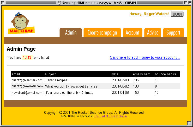
Screenshot from the original “MAiLCHiMP” from 2001.
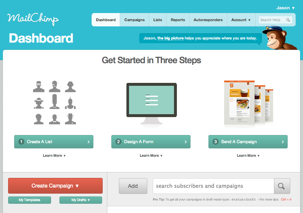
Life in the web industry always seems to clip by at a pace that feels a bit like dog years. While time does fly when you’re having fun, the trends, techniques, and technologies change so fast that a 2 year old site or application design really can feel like it’s a decade old. When I started at MailChimp in early 2010, this is what the application dashboard looked like.

MailChimp as it looked way back in 2010. “How you livin?”
As you can see from this week’s newsletter header, It’s a giant leap from “MAiL CHiMP” circa 2001, but there were some things that still worked the same way. Up until that point in MailChimp history, the markup and styles for every component of the application had been — quite lovingly — coded from scratch. Sure, we used common classes for things like buttons and grids, but those auburn tones, font styles, and gradients in the design above were baked in all over the CSS. In short, it was far from what our friend Brad Frost would call Atomic Design. When we started talking about a full redesign in mid-2010, we knew things had to change.
We started toiling away months before we ever saw a single screenshot of what DesignLab was conjuring up for MailChimp’s new look. Our primary focus for this “pre-design” was to reduce repetition in our CSS to make the actual redesign process easier. We did this by combining similar interface elements into reusable patterns. The metric we used to gauge our success was total CSS size. Over the six months before we released the 2011 redesign, we managed to cut about 120k from our CSS. Here’s what the dashboard looked like after we launched.
The MailChimp dashboard from February 2011 until June of 2013.
As we were creating these reusable patterns, we started archiving them in an internal “cheat sheet” for a couple reasons. First, we wanted to create a style guide that anyone writing front-end code for the app could use as a shortcut. Second, we also wanted a test page to show whether or not the changes we made to our pattern CSS would break things in the app.
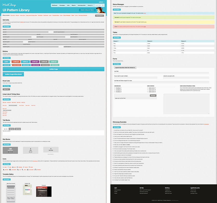
The first version of the pattern library which we relied on for over 2 years.
Fast-forward to November 2012
Knowing that we were going to be embarking on another big redesign, we started crafting a brand new pattern library. We already had a very modular approach to working on the app, so our focus the second time around was making things responsive, more user friendly, and even more flexible. As with the previous redesign, our team was working for several months before the actual design was settled on.
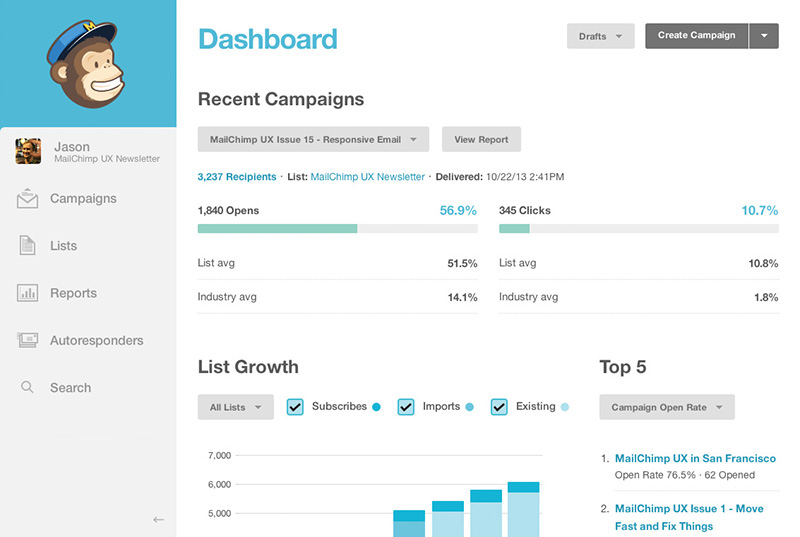
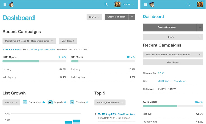
The current MailChimp dashboard at desktop, tablet, and phone widths.
By the time we launched the (new) New MailChimp, we had a much more extensive collection of common interface patterns. Unlike our old pattern library, though, we made this one public. While we haven’t posted about it anywhere yet, it’s been available at http://ux.mailchimp.com/patterns since the 2013 redesign launched in June.
Now, you may be asking: why would we publish something like this when it probably won’t benefit anyone outside of MailChimp? Well, it’s for the same reason that we keep posting to this newsletter. We want to be transparent, share our challenges, and show our work. As with just about everything on the web, our pattern library was inspired by the work of many brilliant people and we hope it’ll inspire others as well. It’s not perfect and you might even find it broken at times, but it’s served us well for the last 6 months – which is really like 3½ years in web industry and dog years.
Visit the MailChimp Pattern Library