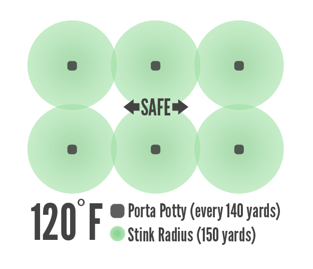
My brother Jered is a nurse in the Air Force and currently stationed at Balad Air Base in Iraq. Today he posted on his Facebook wall that:
“It’s 120F. The stink radius of the porta-potties is 150yards.
There’s a porta-potty every 140yards = nowhere is safe.”
I quickly replied with the image below and this note: “Your logic here isn’t entirely accurate. To illustrate, I’ve created the following infographic.”

…and then I realized I made a major geometry fail (radius, not diameter!) and posted the following correction:

Haha, this is awesome. Infographics are great, but I gotta ask, is there a method to creating good and simple info graphics (like there is for good design)?
I think the method is to read anything and everything by Edward Tufte. 🙂