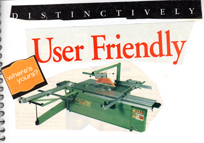
This probably requires a little explanation. While I was cleaning the office last weekend, I came across a sketchbook that I used when I was a kid. I’m guessing the first few drawings are from 7th or 8th grade and the last few marked pages are from my senior year in high school. For me, browsing through the pages of this book is like reading an old journal. In it are loads of experiments in pencil drawing, charcoal, watercolor, stippling, colored pencil, and even some aerosol airbrush. Artistically, the contents are mediocre at best, but it was astonishing to see how engaged I once was in learning how to make art.
As I was flipping through that tattered old Mead Sketch Diary, I came across several pages containing collages of cut and pasted typographical compositions. They’re all fairly simple and rough, but that was intentional. At the time I was in my sophomore year of high school and had a very specific source of inspiration: a local zine called Delusions of Grandeur. Each photocopied issue was filled with music reviews, poetry, drawing, and witty collages of random typographical nonsense. I’m not really sure who was behind it, but it rocked.
So that’s it, really. I was inspired by something I thought was cool and wanted to do it my own way. I think that’s a lesson we could all use to re-learn every now and then. I’ve scanned the pages from this section of the old sketchbook and I’ll try to post a new snippit every week or two. I thought this particular composition was interesting as the phrase “User Friendly” has become a lot more commonplace since the mid-nineties.
