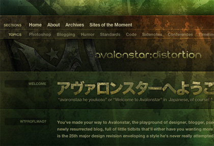
I couldn’t help but grab the arms of my office chair to keep from falling over this afternoon as I checked out Bryan Veloso’s latest redesign of avalonstar. The layered textures, unorthodox structure and analogous color scheme really set it apart from anything else out there.

In the words of Levar Burton, “Don’t take my word for it!”
For the last few years, it seems the web-design community has been in a bit of a rut. I’ve seen a lot of unique design flicker through the CSS galleries, but we (myself included) have been relying too much on cozy conventions. We know the principles of beautiful design, but we’re too stuck on standard site structures, browser limitations, and popular opinions to really put those principles to test. It seems the times they are a changing though as Bryan isn’t the only high-profile blogger pushing the envelope:
- In January, Dan Cedarholm realigned with a gridlastic (grid-based, but scalable) version of his current site design.
- Then, in February Jeff Croft unveiled a redesign consisting of brown, pink, and yellow. While that isn’t a color combination I recommended in my book, he pulled it off and it looks great.
- Finally, Nathan Smith created a whole new CSS Framework in response to a personal “design itch”, and has announced that he’s using that new framework in his latest redesign.
That’s by no means a cumulative list; I’m just saying that exciting, industry-changing experimentation is coming back into style. I’ve personally had the redesign bug crawling around on my back for over a year now, but the desire to do something “different” has been keeping my mind churning and my hand from moving. Recent redesigns like Bryan’s are definitely fuel for the fire, and I’d love to see this glimmer of change flame up into a revitalization of the personal website. I think it’s time for us all to take a a step back and realize that, “We are the music makers, and we are the dreamers of the dreams!”
Yes indeed, I agree completely! I’ve been wondering the same thoughts as well, and am hoping to throw yet another spin into the mix when I finally re-launch my own little experiment.
After what Bryan did though, I do believe I have my work seriously cut out for me.
Great Oompa Loompa quote! that movie still scares me…dont know why.
Seriously though, great post. Bryan’s site does look awesome. I also have the re-design bug(or ‘design’ bug in my case) and need to get on with it. I’m getting sick of spending my time at work fixing stuff for old browsers; its about time to have some fun and work with far less restraints. No more designing aftermarket parts for a 1970’s Buick when I can have a Porsche.
There’s a corrolary there, in that list. Bryan used my Photoshop template PSD file as a starting point for his design. I’m almost jealous, since it’s far better than anything I myself could have created! Synergy baby, woot.
Wow. That is gorgeous. I’m really itching to get in the sandbox and play too, lately. This whole day job thing keeps sapping my energy – I’m using an out of the box blog template which is just tragic. I think a web design commune is the only answer. Kidding.